
The Logo
Moorview Care’s logo uses a specific font, which I narrowed down to the font family, and chose the closest visual match.
Given Moorview’s website uses Wix as a backend, the logo is rendered at whatever size is needed by the website, so it was a simple case of asking for the full resolution version of the file, which was a 13295×7059 pixel PNG. A more than useful enough resolution to do font detection on.
Font Spring’s analysis of the image said it was one of 3 fonts:
- Volkswagen Serial
- VAG Rundschrift
- Rundschrift Pro
Some of these fonts had quite high price tags (+£20), which was definitely not worth paying for the purposes of parody, criticism, and review.
But I found VAG Rundschrift BQ online as a free for personal use download, and felt it was a close enough visual match (if not exact).
I then imported the PNG into Photoshop, deleted the original ‘care’ line and then added ‘do not care’ and applied the original colours, and lined it up properly. Then I exported it as a suitably small transparent PNG, ran it through optipng, and uploaded it to the website.
An alternative method I could have used, I could have downloaded the woff2 file from Moorview’s website, converted it back to a TTF and used the exact font, but I only realised this after I’d already matched it visually.
If you’d like a scaled version you can grab it here. If you’d like the full resolution version for some reason, you can grab that here.
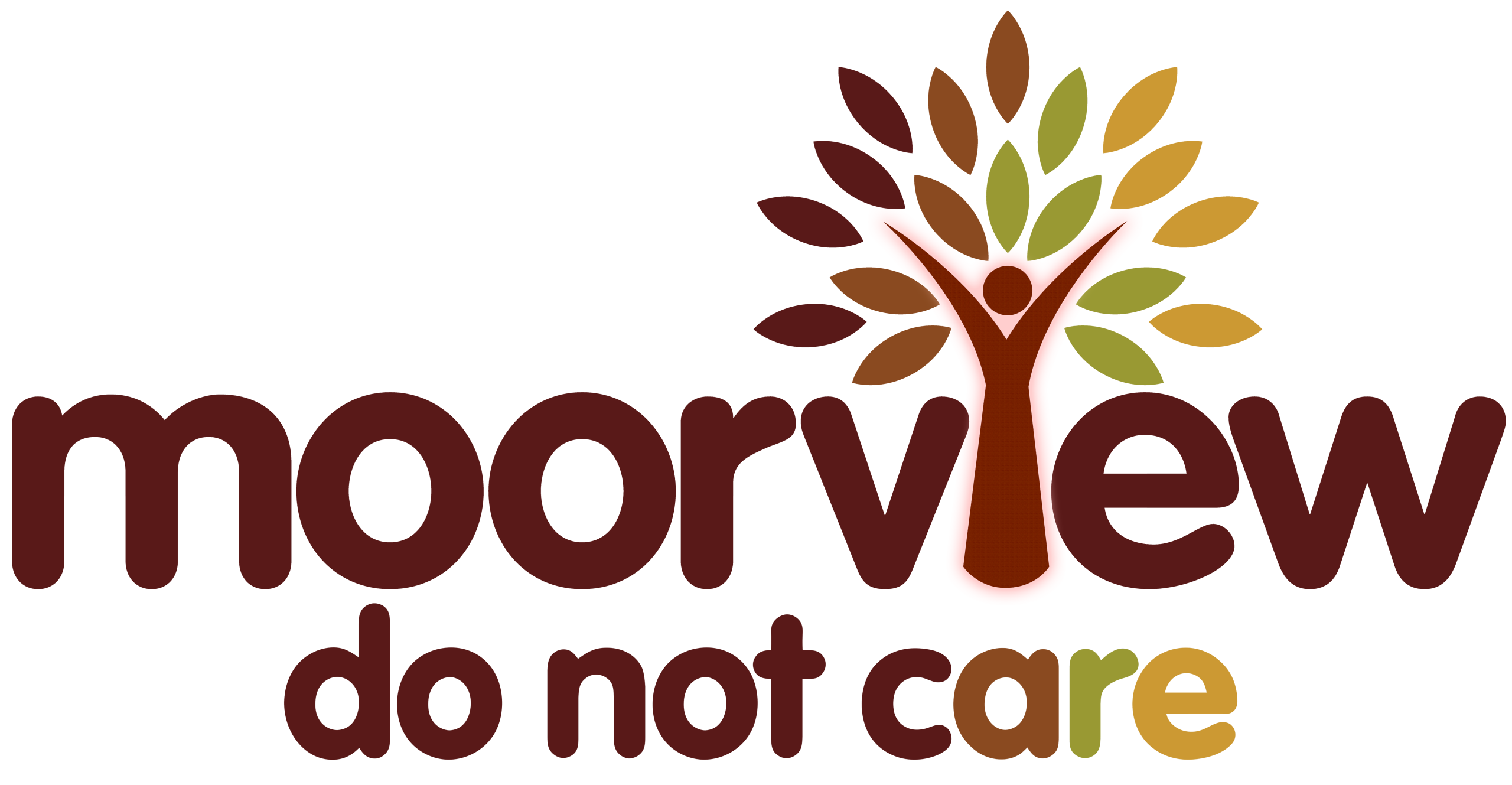
I am, however, quite pleased with the result. I think it would look quite good on a coffee mug!
Updated links for the ‘Scorched Earth’ palette.